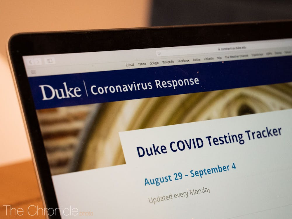
Duke rolled out its COVID-19 tracking dashboard Aug. 19. Other universities in the Triangle also have trackers—but they don't all report the same data.
The Chronicle compared the roll-out process and content of dashboards at Duke, University of North Carolina at Chapel Hill, North Carolina State University and North Carolina Central University.
Roll-out process and reporting frequency
Duke’s dashboard is relatively new compared to the other universities; it was published the night of Aug. 19, and an official release was posted on Twitter by Duke Today Aug. 21. In comparison, UNC first announced plans to publish a dashboard July 30, and NCCU first referenced a tracking dashboard in an Aug. 13 news update.
The dashboard is maintained by the Office of Government Relations, Michael Schoenfeld, vice president for public affairs and government relations, wrote in an email. All data is collected and analyzed by a team from Duke’s coronavirus task force.
Each of the four universities had a different approach to reporting data upon launch. Duke, NC State and NCCU each announced that tracking dashboards would be updated weekly. NC State switched to daily updates beginning Aug. 19, but Duke continues to update its dashboard on Mondays, and NCCU also refreshes its numbers weekly.
UNC initially disclosed daily case numbers but later switched to weekly reporting. The university cited the Family Educational Rights and Privacy Act as the reason that the dashboard could not be updated with daily case numbers, according to The Daily Tar Heel. However, the dashboard was changed to reflect daily numbers once again Aug. 20.
Case counts, isolation and quarantine
Duke’s dashboard groups students separately from faculty and staff for the purpose of case reporting. Similarly, the dashboards for UNC and NC State include distinct case numbers for students and employees.
In contrast, NCCU’s dashboard identifies three groups: students, employees and subcontractors. Only one case has been reported among subcontractors as of Sept. 4.
While NCCU only reports cumulative case numbers, the other three universities include information about how many cases were reported each week, in addition to cumulative numbers. Duke does not provide a daily breakdown of case numbers, while UNC and NC State do.
UNC’s dashboard includes cases from as early as February 2020, while NC State and NCCU report cases beginning March 13 and July 1, respectively. In contrast, Duke’s dashboard contains information beginning Aug. 2, which excludes the 26 members of the football team who tested positive for COVID-19 before then.
UNC and NC State both include the test positivity rate in their respective dashboards. The Duke dashboard does not state positivity rates, although it reports the total number of tests and positive results each week. NCCU does not report testing numbers.
Each university also takes a different approach to including self-reported data.
Duke’s dashboard primarily reports cases in relation to testing, although precautionary quarantine can be voluntarily reported, according to the notes section. NCCU’s dashboard includes information “based on cases reported to the University and verified by the Student Health Center and the Department of Human Resources.” It does not include “individuals who are self-quarantining without a confirmed diagnosis”.
NC State took a similar approach earlier in the semester: The dashboard only included cases that were confirmed by Student Health Services or via opt-in surveillance testing Aug. 16. The university eventually began including self-reported cases in overall case counts Aug. 18, as well as on the dashboard.
UNC’s dashboard is the only one of the four to include the locations of on-campus coronavirus clusters. NC State has reported multiple clusters since Aug. 18 and NCCU has reported one. UNC has also reported several clusters since students returned to campus. Duke has yet to report any clusters.
UNC also reports the current occupancy of quarantine facilities on campus and overall housing occupancy. Similarly, NC State publicizes occupancy numbers on campus as well as the number of people in quarantine or isolation off-campus. NCCU’s dashboard does not indicate how many individuals are in quarantine or isolation.
Although Duke reports the number of individuals who are in quarantine or isolation, it does not report the occupancy of rooms set aside for this purpose.
“Duke has more than 300 designated isolation and quarantine spots for students who live on campus; only a small fraction have [been] used,” Schoenfeld wrote in an email to The Chronicle. “The vast majority of students who have been identified for quarantine and isolation live off-campus and are required to quarantine or isolate in their residence.”
Get The Chronicle straight to your inbox
Sign up for our weekly newsletter. Cancel at any time.
Schoenfeld also clarified that these numbers referring to students in isolation or quarantine only apply for the given week and are not cumulative.
“People are coming in and out of quarantine and isolation every day,” Schoenfeld wrote.
Cleaning and protective equipment
UNC includes a colored indicator for availability of community protective equipment, such as masks, hand sanitizer and disinfectant. Green indicates a 30-day supply is available or expected to be delivered within 30 days, while yellow and red signify different levels of more limited supplies.
A similar indicator is used for “maintenance of enhanced cleaning”, which is defined as “disinfecting two to four times daily and one daily deep clean,” per the dashboard.
In contrast to UNC’s color coding, NC State includes exact numbers for supplies distributed to campus” 416,000 face coverings and 610 gallons of hand sanitizer, as of Sept. 6. The dashboard does not indicate usage or demand.
The Duke and NCCU trackers do not include information about supplies on their respective dashboards.

Nadia Bey, Trinity '23, was managing editor for The Chronicle's 117th volume and digital strategy director for Volume 118.

