One of Duke’s least popular websites is getting a makeover.
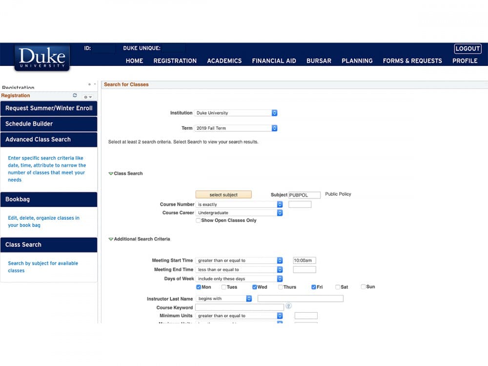
For the past five years, students have complained about DukeHub, a website for Duke student curricular planning and scheduling, as being “old, antiquated and slow,” said sophomore Shrey Majmudar, senator for academic affairs, who is working on the DukeHub project. In an annual survey, Duke Student Government included a question about the student experience with DukeHub to gauge frustration with the site and determine upcoming projects.
It hasn’t been until this year that the DukeHub project finally gained enough institutional support to be pushed forward, said junior Tommy Hessel, vice president of campus life. Duke first looked to new cloud-based solutions to build a new website but decided that those cloud solutions would not be sufficient.
The current version of DukeHub runs on Oracle PeopleSoft, a 20-year-old platform on which institutions can build their own customizable pages. The University has used this feature to add branding to DukeHub and Duke-specific features, such as the “modes of inquiry” and “areas of knowledge” labels on the registration page.
Leaders of the DukeHub project have since discovered the vendor HighPoint Technologies and have been since working with them to build an improved DukeHub. The new DukeHub will be based on HighPoint’s CampusExperience platform that will run on the existing PeopleSoft software foundation.
The result will be a sleeker, more visually appealing and more intuitive website for students and faculty.

Chris Derickson, assistant vice provost and director of student information systems and services, emphasized the collaborative nature of HighPoint and Duke’s partnership to create a new website.
“Duke is a design and development partner with HighPoint,” he said. “We are not just buying a finished product.”
A new version of DukeHub was released Oct. 17 to a pilot group of about 200 undergraduate students who attended town hall meetings two weeks ago with the CEO of HighPoint George Amalor. The class search feature of DukeHub was a major target for changes, having been identified as a source of grievance for students in the DSG survey.
“Class search has been terrible, frankly,” Majmudar said.
He explained that the new DukeHub allows students to search for courses by subject and other criteria. Drop-down menus will also appear for each class, and students will be able to register directly from the class search page, eliminating the intermediate step of bookbagging.
Another new feature is the degree planner, which allows students to track their progress toward a degree in their major, minor or certificate. There will no longer be the need for each tab’s landing pages, as each section of DukeHub will contain a dropdown menu, Majmudar added.
“This is just so much of a cleaner interface to find things,” Hessel said.
The project is still in its early stages, and there are still many issues to be dealt with. Certain features, such as the ability to request an official transcript, are missing from the current version of the new version. Leaders of the project received a lot of feedback from the pilot group on errors with the webpage.
“Right now there are some features that are hard to navigate, so we are still in the troubleshooting process,” said Lisa Tang, a first-year student in the pilot group.
The plan is to have the pilot group register for Spring 2020 courses using the new DukeHub and then roll out the final version to all students for Summer 2020.
Correction: Shrey Majmudar's name was misspelled in one instance as Sajmudar. The Chronicle regrets the error.
Get The Chronicle straight to your inbox
Signup for our weekly newsletter. Cancel at any time.

