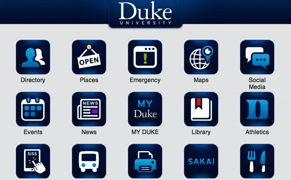
Duke is in the process of making a number of coordinated changes to its online presence—including a redesigned homepage, which launched Jan. 16.
The duke.edu site was redesigned to follow modern trends—colorful graphics, plenty of whitespace and an emphasis on a consistent site across mobile platforms, said Denise Haviland, director of the Office of Marketing and Strategic Communications. The new homepage also creates a more seamless experience with other Duke sites that have launched in the last year, including the admissions, financial aid and library sites. A new Duke Health site reflecting the same trends is expected to be released in the next week.
Blyth Morrell, assistant director of the Office of Marketing and Strategic Communications, said their office is responsible for maintaining the Duke brand, and as such has acted as a facilitator for other departments looking to update their websites. Morrell said she’s happy that the updates—though pushing in the same direction to build the Duke brand—have been completely departmentalized.
“They have adopted it very organically,” Morrell said. “They are coming together in a really natural way—each group gets to maintain its own identity while maintaining the bigger Duke feel.”
Haviland emphasized that this is an effort to improve the overall Duke online experience.
“It reinforces the Duke brand. We’ve been working towards a coordinated look and feel throughout the University, and what you’re seeing is the result of that,” she said. “This is the first time that the look and feel of these major sites has been in concert.”
Miranda McCall, associate director of Financial Aid, led the redesign of the new financial aid site, which launched December 16. She explained that it was especially important for the financial aid site to maintain the feel of the admissions site, since financial aid is a natural second stop for applicants.
After two attempted launches in the Fall, the library site went live Jan. 13 and has been receiving positive feedback, said Emily Daly, head of user experience for the Library system.
The new homepage’s launch has met with positive feedback, according to Morrell, who led duke.edu’s redesign. And because the site was designed with “an eye towards flexibility”, Morrell stressed that it is very easy to update the site to respond to suggestions.
Students like Dan Deng, a senior majoring in computer science, thought the new homepage was a positive step.
“The fact that the site is responsive—able to be viewed on mobile and desktop—is definitely a step in the right direction,” Deng wrote in an email Monday. “The website has a more modern feel in general, and the design is pretty similar to launch pages used by popular start-ups.”
Deng also mentioned that the site’s lack of a search bar on the main page was inconvenient, but Morrell said that this was a launch-related bug which should be fixed soon.
Michael Schoenfeld, vice president for public affairs and government relations, emphasized the importance of the homepage launch.
“For many people around the world [the homepage] is their first encounter with Duke, so it needs to be attractive, compelling, functional and intuitive,” he wrote in an email Friday. “This redesign was an effort to take what was already a good and successful site and bring it into a new digital era where viewers are using social media and mobile devices to access it.”
Get The Chronicle straight to your inbox
Signup for our weekly newsletter. Cancel at any time.

